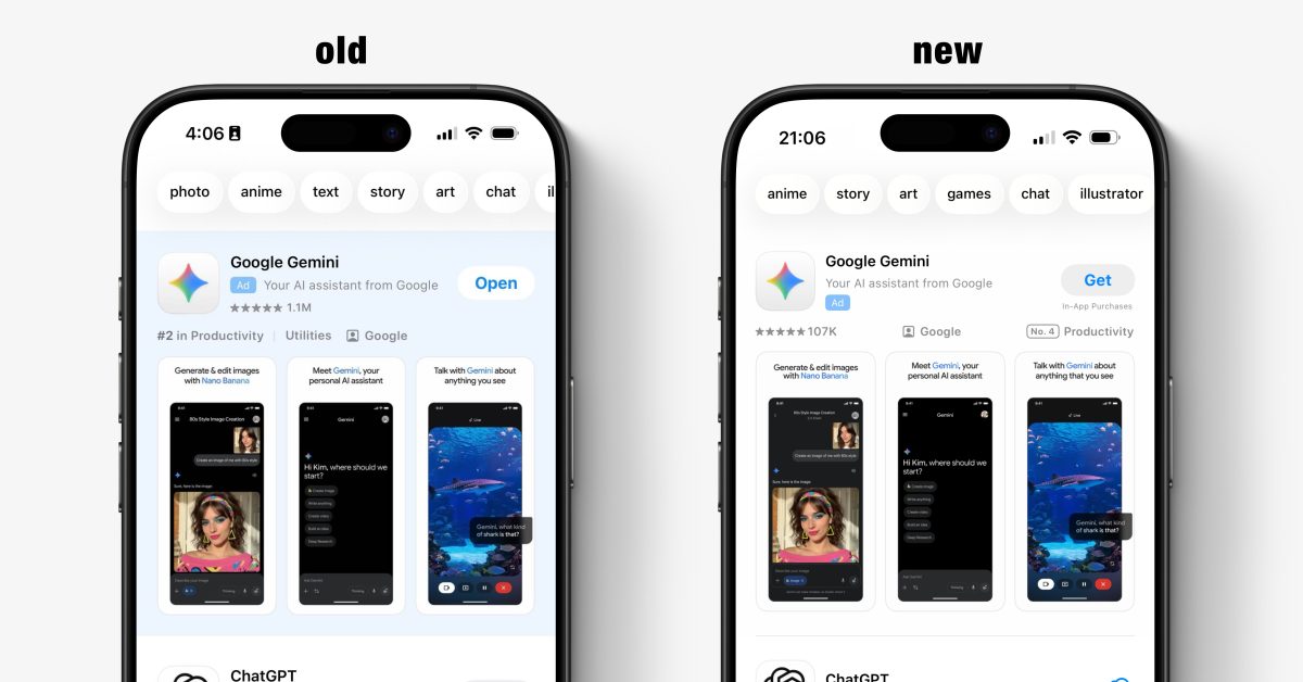
Apple is testing a new design for App Store search ads on iPhone. Some users on iOS 26.3 are noticing that the blue background around sponsored results is no longer shown, blurring the line between what paid ad results look like and the real search results that follow.
This means the only differentiator between organic results and the promoted ad is the presence of the small ‘Ad’ banner next to the app icon. Right now, it appears to be in some kind of A/B test phase.
We have asked Apple for clarity on the change, and whether this will roll out more widely in the future.
It may be related to the company’s announcement from December that App Store search results will soon start including more than one sponsored result for a given search query. The removal of the blue background will mean all of the ads will appear in the list in a more integrated fashion.
Of course, this also has the effect of making it harder for users to quickly distinguish at a glance what is an ad and what isn’t, potentially misleading some users into not realising that the first result is a paid ad placement. While not great for user experience, it probably helps increase click-through rates which ultimately boosts Apple’s revenue in its ads business.
FTC: We use income earning auto affiliate links. More.
Check out 9to5Mac on YouTube for more Apple news:
Benjamin develops iOS apps professionally and covers Apple news and rumors for 9to5Mac. Listen to Benjamin, every week, on the Happy Hour podcast. Check out his personal blog. Message Benjamin over email or Twitter.
The easiest way to get into HomeKit and Apple smart home tech. Great for gifts.
Inexpensive, fast, wireless charger for iPhone.


